
By Soumyajyoti Das, Student of Arena Animation, Park Street
“Color is a power which directly influences the soul.” -Wassily Kandinsky
Undoubtedly, color is a very interesting attribute to talk about. The world is, literally, a huge palette of a wide range of colors. It is everywhere and I cant imagine a world without color. Let us understand what color is.
What is color?
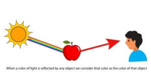
It is a challenge to define or explain color. In simple terms, it is a sense like taste or smell. To experience color we need light. When light comprising of the seven primary colors, falls on an object some of the colors are absorbed & some reflected by that object. Our eyes see the colors that get reflected by the object & call it the color of that object.
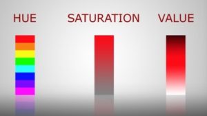
It is defined by its three properties: Hue, Saturation & Value.
Hue: Hue is the name of the color, such as red, blue, yellow etc.
Saturation: Saturation is the bright or dullness of a hue.
Value: Value is light or darkness of a hue.
Types of colors:
After knowing about color, let’s talk about types of colors. There are three types of color:
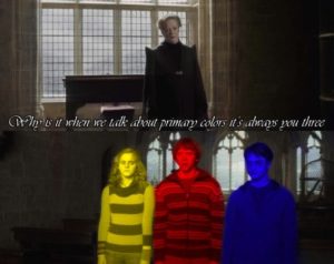
Primary colors: Red, yellow & blue are the three primary colors. They are called primary colors because they cannot be formed by mixing of any other colors. All other colors of the world are derived from these three colors.
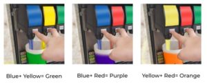
Secondary colors: These colors are formed by mixing of the primary colors. Such as green (blue+ yellow), orange(red+ yellow), purple(red+ blue).
Tertiary colors: These colors are formed by mixing of a primary color & a secondary color. Such as: yellow- orange, red- orange, red- purple, blue- purple, blue- green & finally yellow- green.
Why colors are a very important part of a designing process:
Color, it plays a vital role in design. In a designing process after deciding the shapes it is important to decide which color or colors to use in that design, because color communicates as much as shapes do as each & every color has its own meaning. Such as:
Yellow: Creativity, optimism, liveliness.
Red: Power, security, speed, courage, excitement, danger, aggression.
Blue: Trust, intelligence, security, calm.
Orange: Comfort, warmth.
Green: Fresh, peaceful, Eco-friendly.
Violet: Spiritual, healing.
Pink: Happiness, comfort, love.
White: Peace, cleanliness, simplicity.
Black: Elegance, wealth.
Color psychology is a very important aspect in a designing process. Sometimes it even communicates more than words. Emotional & mental stimulation are heavily influenced by colors.
Colors can easily alter the look & feel of any design. It can create the perfect vibe or can completely destroy the vibe of the design.
Proper color palettes can also increase the brand recognition. Brands usually set colour palettes which are compatible to their products or services. Like- most of the tech brands use blue in their logo as it implies intelligence & security (E.g.- intel & SAMSUNG).

So, before applying color in a design we have to keep all these in mind or else will fail to communicate or reach the target & the message won’t be conveyed properly.
Now, the question is how to use the colors properly in any design? To understand the concepts of color and graphic designing, Arena Animation at Park Street offers a wide spectrum of Graphic Designing that will introduce you not only to these concepts but also train you in Typography, Illustrations and Image Manipulation. You could go on to learn Motion Graphics, the most in-demand skill in today’s scenario where Web & Social Media are influencing our lives so much.


 in Real-Time 3D Design")


 in Real-Time 3D Design")


Very nice
Really nice & depth explanation on an important concept . Loved it.
Comments are closed.