
Introduction
The world is full of colors. They are everywhere, from waking up in the morning to sleeping at night, we see colors. without them things are like black and white movie. Every color represents its own identity and plays an important role. It sends a message and make things more meaningful.
What does color mean (In Design)?
Before proceeding to the topic, we should understand what does color mean according to the design point of view (not physics)? Color is nothing but a source that represents the story of a picture or design and makes it meaningful.
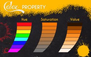
It consists of three properties: Hue, Saturation and Value.
- Hue: Name of a particular color.
- Saturation: How pure the color is.
- Value: The lightness and the darkness of the color.
Colors are mainly divided into two categories.
- Warm Colors (To show fun and excitement): – Red, Yellow, Orange
- Cool Colors (To show calm and peace): – Blue, Green, Violet
Color Psychology
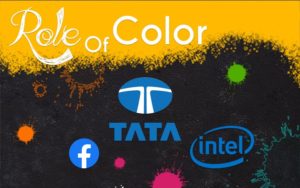
It is a study of colors related to human behavior. The purpose of the color psychology is to determine how colors affect our daily life decision. Between 62% to 90% of designs and products are defined on colors alone. Without colors a brand cannot explain its identity. For example, TATA, FACEBOOK and INTEL The logo of these brands has blue color, and this color shows trust, security and stability.
Importance of color in Design
If a designer uses no color in his design, not a single thing could be conveyed except a plain picture. People should know and understand the importance of colors as every color convey a different meaning and emotion.
Emotions: – Green: – Happiness & Peace, Pink:- Relaxation, White:- Security & Purity, Red:– Danger, Sensuality & Energy, Blue:- Safety, Trust & Calming, Yellow:- Cheerfulness & Free, Purple:- Prestige, Calming & Sensitivity, Orange:- Vitality, Energy, Action & Warmth.
Color Scheme: – Using too much color in a design could be difficult to understand the purpose of the design. It is important to use the color efficiently so that people can understand things better. Use 3 or 4 colors in your color scheme and play with it. Professional Designers use 2 to 3 colors in their color scheme and further they play with saturation and value of those colors.
Legibility: – While creating a design make sure that contrast is present between text and background color. This ensures the legibility of the text which is very important to convey your message effectively and professionally. The contrast should be present between darkness and lightness of each color. If the contrast of the colors does not fit with the design, it may cause a visual clutter while looking at it. This shows the importance of color in design.

Conclusion
As colors plays an important role in design and they communicate without saying a single word. So one should use colors very effectively because a wrong color scheme can ruin a brand reputation. If you are a beginner and want to learn about colors from scratch, Arena Animation Park Street provides you an environment where you can learn and develop your skills and not only about color but more about production-oriented things.


 in Real-Time 3D Design")


 in Real-Time 3D Design")


Meaningful article
Meaningful article
Meaningful article
Really nice.. great job
This is superb
Great Article
Got the concept
Comments are closed.