
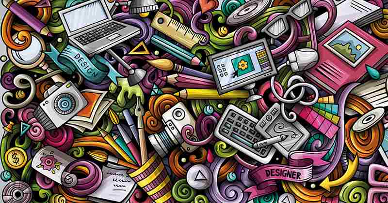
Technology has made it possible for easy access to learning online. As such, thousands of people are learning graphic designing from various apps and YouTube tutorial videos. But, no matter how much you invest your time in these, very often, it is seen that the craftsmanship that is taught in an actual learning institute can take you a long way into honing your skills.
In other words, everyone can become a graphic designer, but it takes real aptitude to become a great one. And what makes someone a great graphic designer? Not just simply putting together pieces of clip-arts, texts and images. But to effectively implement icons and images in a way that grabs the attention of the target audience and helps in selling the main point of the campaign that it is used for. This is why, today, we are bringing before you some of the most effective ways that you, as a graphic designer, can use icons and images in your digital design.
7 Creative Ways to Use Icons and Images in a Digital Design Effectively
Creativity can’t be measured and it is highly subjective. But, if you tweak your creations a bit, it can bring about a whole lot of changes to the overall quality of your end product and would elevate its aesthetic. So, without any further delay, let us get straight into.
Encouraging Interaction
Interaction brings fluidity to a design. So, incorporating it in your design can help you in making it dynamic. Now, the question is how to bring about interaction in a digital design. You may think that you have to fit the icons into specific placements in order to create interactions with users. Well, not really!
This is a strategy that has been used by most template maker since they always go for the three-column icon or text combo in their scroll. What we are suggesting to you is to ensure that the icons in your design command interaction on their own. To do that, you can combine parallax scrolling with iconography. This would ensure that items move across the screen. You can further layer your icons with a background or a set of images as it would help in bringing a lot of dynamism to the overall design.
Cluster of Icons
You know how a collage always brings up the best of a particular series? Similarly, you can do the same with a cluster if icons in your digital design. You can put together hand-crafted icons, sketches, and shapes to create a nice visual that is not only aesthetically but also conveys the message in an interesting way. This really allows you to think outside the box and you can get creative.
For instance, you can build a row of icons and play with them by making then oversize or undersize in order to generate a deeper impact when you feel there is a lack of good visual. The icons that you use can be presented as links. Mainly, the content of your design will influence whether you want the images to stand on their own or create a link of chains. A cluster can consist of anything from a couple of icons to even a dozen of them, whatever suits your requirement, or whatever tells the story in a better fashion. If you don’t want to build a cluster of icons of your own, you can even customize a pack of icons to give life to your campaign. Play around with both the options and see what suits your need in a better fashion.
Custom Sketches
Imbibe the essence of art in your digital design. How to do that? Well, to begin with, think about the icons in your design since icons are nothing but miniature art canvases. Most people these days use line art renderings or super flat renderings in their iconography. As such, there comes a monotonous vibe to all of them.
You can break that up by making your design unique from everyone else’s. For instance, you can incorporate detailed sketching as it would help to separate your work from all of the other generic work. This is where the importance of having the training of a reputed animation institute comes in because the kind of skill that you learn there are going to help you put together. No matter how many YouTube tutorials you watch, the minute details can never be learned from them.
Moving along, another great aspect of this point is that every sketch will be distinct since all of them would be hand-drawn. They would bring a sense of novelty to your design and will automatically help in making them stand on their own.
Visual Interest

Now, this may sound obvious to you but sometimes the most obvious things are the most ignored things. So, we feel that we have to stress on this point specifically. Listen! During the course of your career, you will come across a wide range of projects. Some will be easy, some will be hard. There will definitely be times when you will either run out of great images for the project or find yourself in a situation where you can’t really use any images.
This is where you need to let your creative juices flowing. Even mundane, pale and generic images can look highly interesting when you club them up with fun iconography. You can try and enhance the content of an image or highlight a piece of information or give a cue that leads to an interaction. The possibilities are endless, if you know how to go about the right way, you know.
Bring the Element of Animation
It goes without saying that dynamic animation has way more impact than their static counterparts. There is a reason why people remember dynamic designs longer. Human brains retain memories of dynamic art for a longer period of time since it speaks to a variety of our senses.
This is why you need to bring about as many dynamic elements to your digital design as you can. However, this doesn’t mean that you have to overdo everything. You know the saying that too much of anything can be bad. Sometimes, people make the classic mistake of making the animation movements too fast. This runs the risk of making the entire project unnerving. On the other end of the spectrum, if you make the movements of your animation too slow, then your target audience might invariably miss them. You need to find the sweet little spot in the middle.
Label Charts and Graphs in Your Digital Design
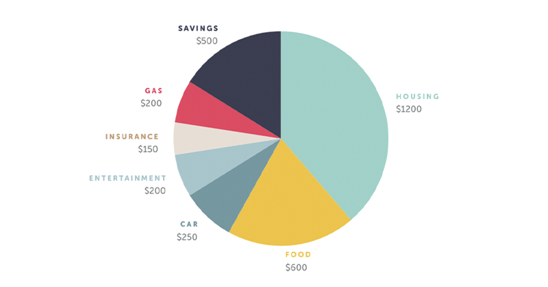
Many times, the campaign that you are designing for would include a bunch of stats and figures. Now, it is your responsibility, as a graphic designer, to figure out how to make those numbers look interesting. In other words, you can’t expect the target audience of your client to waste their valuable time by just reading line and lines of stats and figures.
Thus, use interesting charts and graphs to represent those numbers in your digital design. Make them colourful, make them pop out so that they catch the attention of the target audience in an instant. This is true for all those designs that heavily rely on infographics. Your goal should be to allow the target audience to visualize the text and numbers.
Labelling the charts and graphs can help the common layman understand complex ideas in a simple manner. Make sure that you are using those icons that are relevant to the point. You don’t need to add icons just for the sake of it, you know. When you swap written documents of plain text and numbers for a labelled graph or chart that has visual logos, you end up creating a more accessible, cleaner and, as a result, more effective design.
Consistency
Your target audience should be able to recognise your work. For this, consistency is the key factor. We understand that there are too many likeable styles of icons out there and using all of them can be tempting. But, you also need to add value to your digital design that serves as your signature work.
After all, you don’t want to overwhelm your audience too much. As such, try to find some consistency in the colours, size and fonts of the text that you use in your design so that your brand identity is easily recognisable. This also helps in adding the element of cohesiveness to your design that, in turn, helps in putting a sense of wholesomeness to your artwork.
The idea should be to encourage a free and consistent flow for the audience, not to overwhelm them by throwing in every single colour, font and size that you can think of since that would make your digital design nothing but a gibberish work, and you don’t want that.
To Conclude
Digital designs have a lot of potentials and the usages of icons are infinite. As a graphic designer, it is up to you to decide how you can overcome the challenges presented to you and present them in an interesting and effective manner so that the creative element is nurtured while also putting across the intended message of the digital campaign to its target audience.
Remember, there are no hard and fast rules to the points or tips that we have mentioned in this article. This is a creative field and you are free to play around with them and even mix and match to come up with the best end-product for your client. So, don’t restrict yourself and keep on exploring your creativity.


 in Real-Time 3D Design")


 in Real-Time 3D Design")


