East – West – North – South
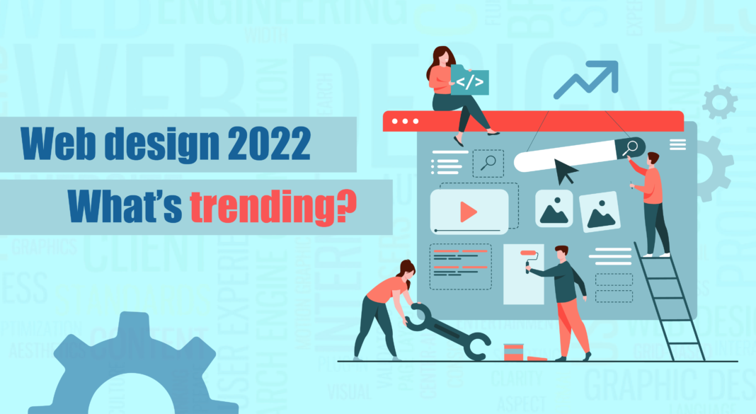
Web design 2022 – What’s trending?
Web design has come a long way from the year 1991, when the first website was published. While the early 1990s saw text-based websites designed to suit the slower speed of dial-up modems, the mid 90s witnessed table based layouts that allowed for more flexibility and creativity, and the incorporation of a few graphic design elements such as animated texts and dancing GIFs.
Come the late 1990s and there was a rebirth in web design; reimagining’s that accompanied the introduction of Adobe Flash; colour-changing navigations, tiled background images, neon colours, 3D buttons, and the ever-popular splash pages. For the first time, the design was visitor-focused. Design now focused more on appearance and usability with structure and navigation becoming important considerations.
The early 2000s brought in CSS which permitted the demarcation of content from design. Overall, there was a better understanding of colour, increased use of whitespace. Resolution and pixelation became important determinants. Usability played a major role in design. But it was only in the mid-2000s with the birth of Web 2.0 that modern web, as we know it, came into the picture. There was a spurt in multimedia applications, the implementation of interactive content, and the rise of the social web. Aesthetic changes followed suit, better colour distribution, increased icon usage, and greater attention to typography. SEO now took centre stage with the end-user always on the mind of the designer.
Into the 21st century, SEO continued to remain in the top position in the industry list of prerequisites and since SEO demanded content, content now became kind whereas web design was concerned; Keyword optimization, inbound and outbound linking, authoring, tagging, and syndication technology such as RSS were integrated into the design by every SEO-conscious designer.
So, what now? What will 2022 bring in terms of web design trends? Well, a few prominent ones are already noticeable. Here is what is doing the rounds in the web design industry at the moment:
One-page delightful mini websites:
Less is more, and so one-page websites are becoming popular, and web designers are ditching lots of menus and navigation for simple scroll navigation; but these one-page websites remain better suited to a narrow subject matter such as a portfolio or the illustration of a single idea. They minimise distraction though, simulating the feeling of holding a flyer or a poster. UX design dominates these websites enabling designers to provide infinite scrolling down a single-page design. Moreover, these sites are mini sites that are based on subtle humour that is panned out through text, imagery and pretty much everything else on the site such as site navigations, buttons and menus. This is art for art’s sake; playfully creative and delightful UX design. But it’s important to be subtle and not overdo the mischievousness of it all.
Web hunts:
Taking playfulness a step further some designers have conceived an entire web page in the form of a hunt; they have daisy-chained pages, protecting certain parts asking the user to guess the password. Of course, clues abound, helping the user to solve a riddle, find a word or a hidden element, or decode a cipher. And the fun is what makes users return to the website over and over.
Picture less hero image:
Designers today are crafting landing pages with more design and less photographs/illustrations avoiding the distraction of a big image, choosing instead to focus on style and content. The idea is to let the message in the hero image carry the weight of the page itself and draw the attention just as quickly as a headline. The bonus we get is to see some wonderfully creative possibilities in lettering.
Collage:
Collage style graphics can add a tactile feel and draw attention to available white space. It allows the incorporation of multiple images. Not centering the design around one single photograph allows for greater scope to create a melange of shapes, patterns, and colours within the collage. A monochrome effect, tint, or filter when added to the photographs can help blend the collage with the overall design.
Typography:
Unusually sized typography is another emerging trend. The words when depicted in a certain size become a graphic element rather than being part of the copy. This technique works across all styles and can be used both in minimalist and maximalist designs.
Interactive Text:
Some designers are making their text dance to the tunes of the user’s mouse. That means, the text moves and plays to the touch of the mouse and also hovers in between. However, it is essentially to focus on legibility as some readers can be distracted by the motions of interactive text.
Visible borders:
A website often looks like it’s floating freefrom in digital space but in reality they are built on a strict grids that are held together with proper code; something that designers have decided to get real with; building websites with visible borders so all sections are easily recognizable from each other, making them easily scannable and often having a retro touch.
Art deco motifs:
Art deco is back in business too because it fits in well with geometric designs that have been in the limelight for the past few years. And together they make beautifully minimalistic designs. Art Deco was the prevailing decorative art style of the 1920s and 1930s. It stood apart in its precise and boldly delineated geometric shapes and strong colours and was commonly used most in household objects and architecture. Today, Art Deco has returned in bold lines, symmetry, simplicity, and an unvaried repetition of elements that are incorporated into modern styles to create distinctive designs that are hailed for their sophistication and elegance.
Memphis design:
Memphis Design, once considered gaudy and chaotic is now high on a designer’s list of priorities. A rejection of minimalism by Ettore Sottsass and his followers, Memphis Design was eventually revived in the 2000s and is now trending again because of its bold adventurism with shapes and colours.
A return to Retro:
Bright background colours, visible table layouts and robotic typefaces; all predominant characteristics of Web 1.0 of the 90s were replaced down the line with newer web design trends. Only that, in 2022, designers are returning full swing to all of these Retro elements. Moreover, they have over 30 years of collective experience to take Retro to the next level.
Neo-brutalism:
Neo-brutalism is derived from the classic roots of Brutalism, an architectural movement of the 50s–70s that had its focus on raw, exposed materials such as concrete. Brutalism has been gaining traction in web design since its digital re-emergence in 2014 in un-styled html, plain backgrounds, asymmetrical layouts, default computer fonts and untreated photos. Starkly arresting, the bareness of this style is often brutally and appealingly honest.
In 2022, there is a general consensus among designers that this style will morph into a more subdued and less extreme version, which will essentially be known as Neo-brutalism; a fusion that will blend the rawness of brutalism with the restrained of minimalism and be a design option for clients who want their websites to be less avant-garde.
Well, as Alfred Tennyson had written, “Ring out the old, ring in the new.” Are you ready to use some of these trends in web design?
If you want a trendy website done according to your specifications, get in touch here.


