Nirabhra Mandal, GWDD, 2nd Sem, Arena Animation, Park Street
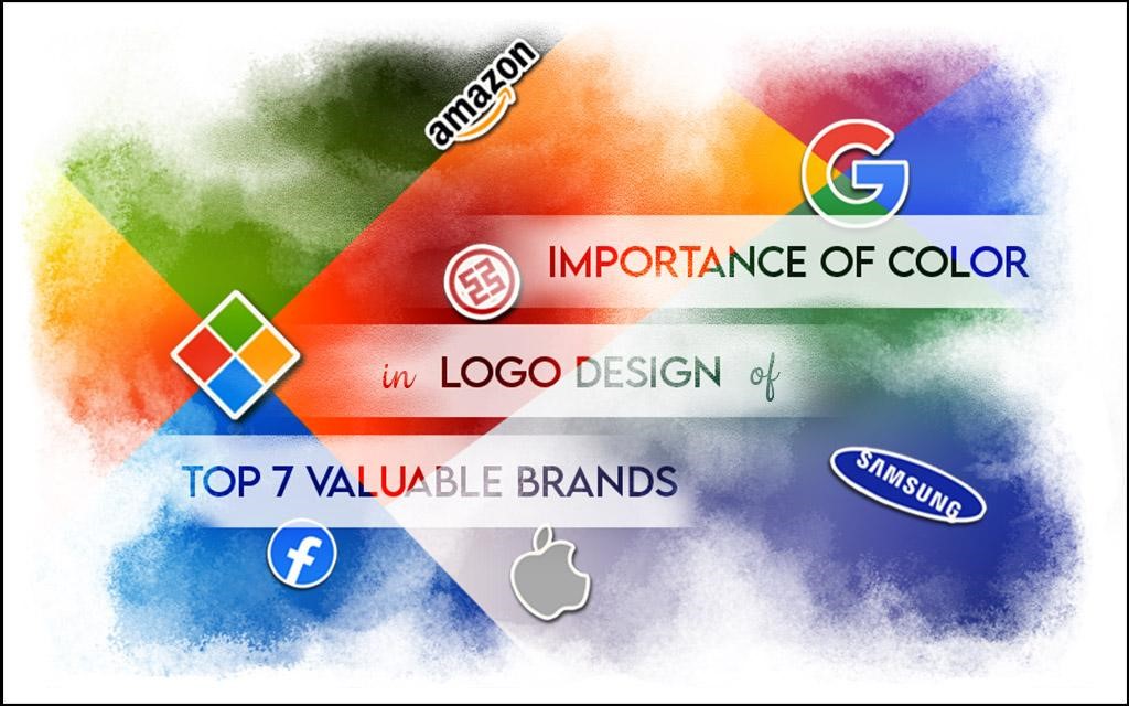
Here we are going to discuss how meaningfully colors are used in the brand-logo designs.
The color combination of a brand can increase the brand-value remarkably when the colors of the logo contain that much power to reflect it’s soul. I have taken the world’s top 7 most valuable brands ’2020 to explain the same.
Now look at the top 7 brands with the highest brand-values along with the colors they used in their Logo Design. The above chart is for better understanding. After the discussion we will conclude the similarities in methods of using the colors or how the colors play an important role in top brand-logos.
1. Amazon:

There are two colors in Amazon’s logo. Black stands for Dominance and Elegance whether Orange stands for Pride and Happiness beside being the most attractive color. This orange colored arrow has been used for happy smiley and to show pride for availing A to Z products. So we can note down the following points –
- Color Types: 2 Basic Colors
- Mood: Warm Color based
- Palette: Combo of Secondary and Grayscale Color
2. Google:

In Google’s logo, Blue, Red, Yellow and Green all 4 colors have been used to show the vastness of their reach in every possible direction or opportunity. Similarly 4 tetradic colors hold equal tension among each other while covering almost the entire taste of colors. Here, the insight color points are –
- Color Types: 4 Basic Colors
- Mood: both Warm & Cool Colors
- Palette: Tetradic Colors
3. Apple:

Apple uses any one of Black, Silver or almost White color. Each of these three colors is a neutral color which makes you secure. It may not be your favourite color but they are the platform of all colors. Also in the practical world they play the same role along with the security. So for the logo of Apple we can write –
- Color Types: 1 Basic Color
- Mood: Neutral Color
- Palette: Grayscale Color
4. Microsoft:

Microsoft also uses Blue, Red, Yellow and Green – 4 tetradic colors. Colourful palette reflects openness, diversity along with optimism. With the 4 panes of colored Window it’s the key to Be What’s Next which is also their tagline. Here also the insight color points are as of Google –
- Color Types: 4 Basic Colors
- Mood: both Warm & Cool Colors
- Palette: Tetradic Colors
5. Samsung:

Samsung has used the combination of Blue, a primary color and a neutral color White. White, a mixture of all primary colors has been used in writing its name where it connects to the greater white world of purity. Whether Blue reflects its reliability & serenity towards the customers. So in this 5th most valuable brand, color insights are like –
- Color Types: 2 Basic Colors
- Mood: Cool Color based
- Palette: Combo of Primary and Grayscale Color
6. ICBC:

ICBC or Industrial and Commercial Bank of China Limited has used Red color in their coin-shaped logo to make one feel the urgency to it. On the contrary Black color shares the dominance as they are the world’s largest bank. We can note down about their color characteristics –
- Color Types: 2 Basic Colors
- Mood: Warm Color based
- Palette: Combo of Primary and Grayscale Color
7. Facebook:

“Blue is the richest color for me; I can see all of blue;”
-Mark Zuckerberg
The founder of the world’s most popular social media, Mark Zuckerberg has a red-green color blindness and can see mainly the blue shades. Beside this the palette of Blue and White is called the corporate palette. Facebook used that blue color for confidence and knowledge whether on the contrast, White, a basic color enhances the blue color with visual comfort also. Here color insights are –
- Color Types: 2 Basic Colors
- Mood: Cool Color based
- Palette: Combo of Primary and Grayscale Color
If we observe the above color insights from all of these most valuable brands in 2020, we can come to some conclusion about the value of colors in Logo Design. And also we can analyze how the colors are used for reflecting the soul of a brand.
Importance of Colors in Valuable Brand-Logo Design:
- Most of the valuable brands use a contrast of 2 colors in their logos.
- All of the colors are Basic colors.
- The brand-logo may use anything from warm, cool, neutral color or any color mixture of them but the important thing is it represents the mood of the brand
- Most of them use a color palette made of mood-color in contrast with a grayscale color.
- Also the palette of tetradic colors is famous for some valuable brands.


Excellent..
Glad you liked the post
Thanks for the appreciation
Really good points and good observation
Superb
Great work. Rich with information.
Nice.. informative..
Nice information indeed..Each and
every explanation is fantastic
Just Brilliant
excellent
Nice observation…nd well described..
Nice..
Really informative!
Great informations. But the logic about Samsung seems like they made the logo first then create the logic somehow
Excellent
Nice article..
Great work
Good content
Great content . Brand image is purely defined by this color combo . Great study .
Cool
Good to learn about importance of colour in brand logo
Great interpretation
Very nice. .
Really amazing!!
Amazing!
Thanks
excellent
Thanks for the appreciation
Excellent
Good one
Comments are closed.